Compound your React
July 9th, 2020 - 10 min read
You have just implemented the latest <Alert> component your team's designers have been waiting for so long. It looks so great. It contains a prop body to display some text, and another prop icon to reflect the criticity level of the alert. It matches perfectly the mockups and the specifications you were given for this component.
You integrated successfully this new <Alert> component into a brand new page of the application you're working on. This feature gets shipped to production. Everyone's happy.
Unfortunately. A few weeks later, the designers show you a new page that uses the <Alert> component. However, this time, you noticed that it has a title and some controls. The body's text style is also different. Great. Now you have to wrap your <Alert>'s component with lots of conditions to render the new display while not breaking the old one. Your component is now already a messy bunch of code, and you pray a moment for the hard time the next developer will have when working on it.


The problem of your component is quite simple: it is not customizable.
The solution to this problem: the Compound pattern. And that's what we'll go through in this article.
Composition
The Compound pattern is a simple extension to Composition. Basically, it relies on the idea that components should render any children given by their parents, and should not need to know what those children contain. This is especially true for "box" & "wrapper" like components. It allows you to create very flexible components.
For example:
const Box = ({ children }) => <div className="StyledBox">{children}</div>

const App = () => (
  <>
    <Box>
      <p>I'm a paragraph in a box</p>
    </Box>
    <Box>
      <h2>I'm a title in a box</h2>
    </Box>
  </>
)
Applying the Composition pattern to our use-case enabled us to use the <Box> component in multiple use-cases. We were able to provide it with different contents: a paragraph and a title.
This pattern is exactly what Compound components are built with: allow other developers to fully customize the content of your components.
You said Compound ?
Now we've seen what Composition applied to React is, let's see what the Compound pattern brings in addition to it.
Compound in a nutshell
Here's my succinct definition of the pattern, applied to React:
The pattern consists into decoupling a complex component into a root component and children components bound to it.
Not quite...tangible, right ? Don't worry, we'll go through examples later 🙂.
When to use it...or not
This pattern cannot, and should not, be applied to all your components. For example, it should not be applied to your atomic components, because it simply doesn't make any sense to compound an atom.
Instead, it makes total sense when used in your molecule components, that are made of atomic components.
For example, the pattern cannot be applied to a <Button> component because it's an atomic component. However, it's perfect for an <Alert> component because it's a molecule component, which renders a view built with multiple atomic components, like a <Paragraph> or a <Button>.
How to apply it
The part you were waiting for 😉.
Since an example is worth a thousand words, let's work on our <Alert> component from the introduction.
Some context first
Before anything, let's make some specs together.
Here's what our <Alert> component should do:
- It can have a title and a body.
- It can have controls like buttons.
- It has 3 states:
success,errorandinfo. - Those states are simply used to determine the
background-colorof the<Alert>.
Basically, when the status is set to info, it will look like this:


The primary approach of someone new to React would probably be to create a single component <Alert> with props to implement the expected behavior. We would have props for the title and the body texts, and a prop for the buttons as an array of objects.
We'd probably end up with something similar to this:
import React from 'react'
import Alert from './Alert'
import { someFunc, someOtherFunc } from './functions'

const MyAlert = () => (
  <Alert
    status="info"
    title="This is a title"
    body="This is a body"
    buttons={[
      {
        label: 'Confirm',
        onClick: someFunc,
      },
      {
        label: 'Close',
        onClick: someOtherFunc,
      },
    ]}
  />
)
This implementation works, sure. But that makes your component way too much resilient. It works for a particular use-case, but it's hardly scalable to others. Remember the situation of the developer in the introduction?
What if we need the body with a particular style on some pages ? What if we need more than 2 bodies ? What if we want to use a link instead of a button ? The above implementation doesn't not allow that. Not without tons of if inside the <Alert>'s code, that is.
Don't get me wrong, components should be resilient enough to be robust when they are integrated into larger applications. But here the resilience is too strong, especially when you are building a re-usable component.
The solution
Rather than using props to specify the entire component, we can apply the Compound pattern.
Remember the definition of the pattern above ? Well, here our root component is going to be the <Alert> itself, and the children components are going to be the <Title>, the <Body>, and the <Button>. We'll also have a <Controls> component to containerize the buttons.
The children components will be accessible as properties from the root component. This is one variation of the pattern, we'll see that there also are other approaches. However, this is the best solution in my eyes, and I'll detail why later in this article. However note that the variation itself is not really important, the pattern remains the same.
That said, here's how our components hierarchy will look like:
<Alert><Alert.Body><Alert.Button><Alert.Controls><Alert.Title>
The main component, <Alert> is really light. All it does is setting the correct background-color of the alert, and it simply renders any children you pass to it. Remember: Composition 😉.
Simplified for the purposes of this article, it will look similar to this:
import React from 'react'

const Alert = ({ children, status = 'info', ...rest }) => {
  return (
    <div className={`AlertContainer-${status}`} {...rest}>
      {children}
    </div>
  )
}
It mainly acts as a container. Now if you add the <Alert.Body> to the example:
import React from 'react'

const Body = (props) => <p className="AlertBody" {...props} />

const Alert = ({ children, status = 'info', ...rest }) => {
  return (
    <div className={`AlertContainer-${status}`} {...rest}>
      {children}
    </div>
  )
}

// We expose the children components here, as properties.
Alert.Body = Body

// We only export the root component.
export default Alert
The same goes for the other children components: the Title, the Controls and the Button.
What is awesome with this pattern, is the fact there is not a unique way of using the component. We can use it and override it any way we want to.
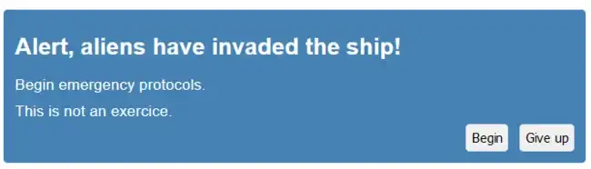
Here's one possible way to use it, and the one that renders the Alert in the image above:
import React from 'react'
import Alert from './Alert'
import { someFunc, someOtherFunc } from './functions'

const MyAlert = () => (
  <Alert status="info">
    <Alert.Title>Alert, aliens have invaded the ship!</Alert.Title>
    <Alert.Body>Begin emergency protocols.</Alert.Body>
    <Alert.Body>This is not an exercice.</Alert.Body>
    <Alert.Controls>
      <Alert.Button onClick={someFunc}>Begin</Alert.Button>
      <Alert.Button onClick={someOtherFunc}>Give up</Alert.Button>
    </Alert.Controls>
  </Alert>
)
You want to add a body before the title ? No problem. You want to use a h5 element for one of the bodies ? No problem. You want to add a link in the controls ? No Problem.
Here you go:
import React from 'react'
import Alert from './Alert'
import { someFunc } from './functions'

const MyAlert = () => (
  <Alert status="info">
    <Alert.Body>Begin emergency protocols.</Alert.Body>
    <Alert.Title>Alert, aliens have invaded the ship!</Alert.Title>
    <h5>This is not an exercice.</h5>
    <Alert.Controls>
      <Alert.Button onClick={someFunc}>Begin</Alert.Button>
      <a href="https://google.com">Give up</a>
    </Alert.Controls>
  </Alert>
)
That's the power of the pattern: we keep the functional behavior of our <Alert> component, while we can customize its content any way we want, if needs be.
Also, it really helps other developers to understand and "preview" the DOM your component will render, since the pattern is following a Declarative paradigm, just like pure HTML does.
This pattern is a must do for components libraries, as it offers so much customization to its users. The most used react libraries out there are built on this pattern: Material-UI, Ant Design, React Bootstrap, Components-extra (okay, this one is mine), and many others.
You will find the full example and implementation on this CodeSandbox: https://codesandbox.io/s/serene-snyder-led4l.
For skeptics
When you have been using the "naive & default" approach forever when using React, it can take some time to fully understand how powerful the pattern is.
At least, I was skeptic for some time.
The first version of my react components lib was not implementing this pattern, and that was a big mistake. I use it on several projects, and I quickly realized that its components were not customizable enough for all my use-cases. So I rewrotte it entirely using the Compound pattern, and it solved many, many problems.
You could also argue that this pattern makes your components not resilient enough. And to this I'll simply answer: nothing stops you from abstracting your component by wrapping one of its implementations in another component of your own. Just like in the above examples, in the <MyAlert> component. You won't have to duplicate it doing so.
You could also argue that this pattern increase the verbosity of React, which is already quite verbose to start with. Well, to that I will answer that, according to me, trading some extra lines to get a fully customizable component is the best deal you can make.
The variations
Like I wrote earlier, there are mutliple variations of the pattern - however we'll only go through the 2 main ones here.
The first consists into adding the children components as properties in the root component, like in this article, and the other consists into exporting them aside the root one, as independant components.
So, in other words, if we use the same example: <Alert.Body> versus <AlertBody>.
In my opinion, the first variation is the best one because:
- The
childrencomponents are not exported, thus it helps the users to understand that they must be used within therootcomponent. - It doesn't mess up your exports, and helps prevent export collisions.
- You don't end up with
<AlertControlsLeftButton>-like names, which are hardly readable. - You can take advantage of TypeScript to define those properties inside the
rootcomponent.
However, there is one dis-advantage, which is Tree Shaking. Since all the children components are imported as properties, your bundler will not tree-shake them if, even if you do not use all of them in your code. The 2nd variation (used by Material-UI), will enable Tree-Shaking by design.
To conclude
If you've already opened your favourite IDE to start experimenting with this pattern, or if you discovered it thanks to this article, then I hope you enjoyed this article and that it was not too messy.
On a more serious note, the Compound pattern really is a great solution to enhance considerably the custumizability of your components. However, note that it's great only when applied on complex and molecule-like components. As always, it's a question of finding the best balance for your problem.
Please, not do not hesitate to reach out on Twitter if you want to comment on this article.